Paged

Paged

Paged składy

Brand design.

  • logo
  • website
  • content

Challenge

Paged is a significant Polish company with a well-established position in the lumber market, producing wood-like materials used in furniture, construction, sports and many other industries. Paged Składy is one of the largest distributors of boards and plywood in Poland, and its commercial offices are located in six regions.

The aim of the project was to create a new web site for Paged in WordPress and to develop a brand identity that is consistent with the company’s “Technology-based Synergy of nature” theme.

Solution

The creation of a comprehensive brand book gave the company full control over its graphic identity. The assets have been used in logos, stationery, business cards, on the website and in graphic info.

Brand design

Brand design

We have created a whole brand book and helped with protecting the copyrights. The beautiful design goes hand in hand with functionality and simplicity that the wood industry appreciates. The company supplies products for furniture, construction, glass, packaging, floors, shuttering systems, interior equipment, car-building, trailers and playgrounds, set design, exhibitions, events and sports accessories, and many other industries where wood-based panels are indispensable. Need to design a brand? We’re happy to help.

colors

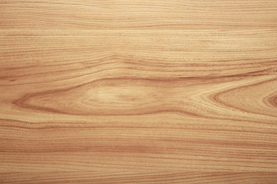
We have created a site that draws the viewer’s attention to the warm nature of wood as a building block for a variety of things. The manufacturer produces components for both construction, finishing work and furniture industries.

catalog

The page has been divided into several separate sections representing each product. Thanks to a clear layout, it is easy to find to fitting solutions.

logo

We have once again finished the job comprehensively. From the logo and its usages to a website that represents the company on the web. We can do the same for you!

other projects:

Ośrodek dojo stara wieś, trzy domki i trawa zielona, niebieskie niebo, wiosna

Cargomove

Cargomove

Cargo Move

Key visual.

  • logo
  • website
  • content

Challenge


The Cargo Move logistics operator offers a full range of services for shipping goods by sea. Arrangement and operation of freight transport within and outside Europe offers the opportunity for far-reaching trade, taking into account the individual needs of the client and freight challenges. Cargo Move is a marine freight expert.

The company needed a recognizable, transport-related identification and a clear information website.

Solution


Comprehensive branding gave the company full control over its graphic identity. The created content has been used in logos, stationery, business cards, on the website and in graphic info.

PRESENTATION

Key visual


We’ve designed a complete brand book and helped register the rights online. Beautiful design goes hand in hand with functionality and simplicity that the transport industry appreciates. If you want to move a lot of merchandise from a long distance, and travel time isn’t your priority – consider Cargo Move as your supplier and freight planner. The popularity of this form of transport is mainly due to the attractive level of cost-effectiveness of the service. In the case of transport by sea, the goods are transported in containers, refrigerated containers or holds in the case of products without packaging or in tankers suitable for carrying liquid substances.

colors


We decided to use a pallet representing the colors of water and air-related elements. The blue tones proved to be a bullseye and perfectly complemented the logo in terms of brand association with a specific field.

pictograms


For this customer, we have also designed icons that graphically represent the individual departments in the company that handle different modes of transport.

logo


The simple combination of a graphical interpretation of a container and a text consisting of the client’s own name resulted in a  simple, closed graphic symbol composition. The customer and his stakeholders have taken a liking to this logo.

other projects:

Ośrodek dojo stara wieś, trzy domki i trawa zielona, niebieskie niebo, wiosna

Knowit

Knowit

Knowit

Graphic presentation.

  • graphic presentation

Challenge


Knowit is a brand that supports businesses and organizations in digital transformations, simplifies people’s everyday lives and creates secure and innovative solutions that meet sustainability goals.

Solution


Several images and key phrases are worth more than endless essays. We’ve made a graphical presentation that explains the entire concept.

PREZENTACJA

Graphic presentation


We have based the graphic presentation on a comprehensive interview, so that we could establish the strong and weak sides of the project. Workflow management enables  us to create a product which meets the client’s needs and presents aspects that are important from the business point of view. We’d love to help you as well.


colors


We have chosen stimulating colors. I have selected cheerful colors that bring freshness and modernity to mind. The functionality of this choice is an easy way to communicate key information and emphasize important sentences.

accents


Attention can also be effectively drawn through contrast. Color has a key function, but simple graphic accents, which the recipient can identify with specific areas, are equally important. The correct layout is crucial.

information


In order for it to be easy to remember, the amount of information that we provide to viewers must be skillfully balanced. The page count and the amount of content on each page is crucial. The balance between and graphic content has a key impact on the learning process.

other projects:

Ośrodek dojo stara wieś, trzy domki i trawa zielona, niebieskie niebo, wiosna

HHUUMM

HHUUMM

HHUUMM

Modern online store

  • logo
  • website
  • SEO

Wyzwanie


HHUUMM is a brand that gives you pleasure of using the products. HHUUMM products are designed to meet all standards with every detail to best meet customer expectations.

You can see this on the new HHUUMM website that is solid and effective with refined details.

Rozwiązanie


A dedicated solution, tailored to fit your mobile phone. This is a modern online shop – you can buy in a few steps.

FILM

Production process video


Seeing is believing. Video is often an easier way to explain how something works than a complicated description of technology. The production process video is very concise, it allows you to understand the process from different points of view and to see its important steps. The video explains to the viewer how an object is designed and opens up their imagination to the applications of the product.

The customer wanted to show the process quite carefully so that investors can see exactly how the product is made and what the substrate of the product looks like.

minimalism


We decided to use as few stimuli as possible and focus on maximizing the functionality of the online store, i.e. the shortest path from decision to purchase.

form


A designer online store is a challenge to the imagination. Creating a transparent form requires many attempts and constant testing. We check every tiniest detail during production.

information


If you need to show a process that makes your company stand out, a proper video will be the best way to show the substance of the matter. We will clearly present the process that is important to you and your business environment, and so, add to your image.

other projects:

Ośrodek dojo stara wieś, trzy domki i trawa zielona, niebieskie niebo, wiosna

Polish Traditional Karate Union

Polish Traditional Karate Union

Polish Traditional Karate Union

Creation of the brand

  • Photography
  • Film
  • Content
  • website
  • Llogo
  • papers

Challenge


When the Union was established, its founder, Paweł Janusz, Sensei, contacted us. The new organization needed many new solutions. Creation of a brand recognizable in Poland and abroad. Coherent and interesting, creating a logotype of cultural significance.

Rozwiązanie


Image film, documentary photography, image photography, website, and social media content. In addition, the logotype and its use in writing materials, plus modern website. Half a year of work on the complete image of the newly established organization. Building a brand from scratch.

Photography

Establishment of the Union


Among the many Karate associations in Poland, this particular one was established to honor the quality of training. The EU authorities are practitioners with extensive experience and physical skills. Sensei of the Polish Traditional Karate Union founded their organization to set new program and quality goals, of which we have become a part.

If you value quality and an impeccable, planned image, contact us, and let’s discuss what we can prepare for your organization. We create solutions that unify the image and lead to an increase in the quality of information transfer. When planning joint activities, we take into account multi-dimensional activities that are to help you achieve measurable success on the Internet.

FILM

Image film


The documentary film presents the moment when the Union was founded, tells about the goals and assumptions for which the Union was founded. A reportage film is a great opportunity to convey your vision and idea of what you do. Show your idea with a moving picture. Your story deserves a movie. It is a documentary that best recounts situations and outlines plans for the future. Schedule a movie for your customers to watch. Think what you can convey with it.

WWW & logo

Website


The complete product that we have prepared for the European Union is primarily an information page. The PUKT website is visited daily by over 1000 people. Frequently updated with new events, it is a guide for karate practitioners in the context of upcoming events, a place where they can view a photo and video gallery, contact the Union, pay membership fees, and register their participation in competitions. Moreover, we have created a map of clubs where you can train this martial art within the framework of the Polish Traditional Karate Union.

brand ID


The resulting logotype is based on three Shin Gi Tai circles – Mind, Body Technique. In the new logo design, we used colors related to the colors of the Master’s Student and the Guide, giving the logo formal meanings. It is good for the brand when the logo also carries symbolic content.


stationary


Student diplomas are a souvenir issued to karate during exams for a higher grade. In addition to this important document, we have also prepared: business cards, letterhead, and UNIQUE cards – an individual electronic document.

systemPUKT


We also contributed to the creation of a system based on a cloud solution, which is used by clubs and players to track training progress and financial settlements at the Player – Club, Club – Unia, Club – Sensei, Unia – Sensei levels.

Creation of a brand


Preparing so many things within one aesthetic has a very beneficial effect on the final visual effect. The whole thing looks coherent and gives the impression of one whole. Scheduled activities controlled by one person responsible for the project help in the correct, i.e. timely, course of work. Creating a brand from scratch is a complicated process that we are ready to undertake to the full extent.

Entrust us with a set of creative activities, especially when the project is limited in time and formal decisions are made by a small group of people. It is easier than for a quick and efficient creative process.

other projects:

Car Bone

Car Bone

Car-Bone

Brand image

  • Photography
  • Film
  • car fairs
  • SOCIAL MEDIA

Challenge


Andrzej! Help, we need photos and videos, we need to use our graphics and launch social media, create a modern and esthetically pleasing brand image. We want to use and access the database with the sales information. What can you do?

Solution


The media has created a distinctive and qualitative image of the company thanks to a consistent vision and consistent visual narration. Videos that were interesting in telling stories, photos that have often become a contribution to conversations and new business contacts. By expanding Instagram’s channel, we’ve been able to multiply the reach of information. We continue to trend today.

Photography

Vehicle photo sessions


The result of the hard work of Team Car- Bone is the unique beauty of a classic German sports brand. Many hours employees in the company spend time creating a zero-day auto.

My job was to take beautiful photos of vehicles that will show in detail what the company is doing. Professional photos of cars are hours spent with the vehicle and space. It’s a lot of post-production color and light. In photography, the only thing that matters is the final result. Automotive photography is a theme that I like very much as a fan of motorsport and craft works of human mind and hands. In this case, product photography shows the effect of a multi-month process of a vehicle restaurant. The car photo inspires others to make similar changes with their vehicles, but also informs potential buyers of the offer on the market.

FILM

Brand image

Since 2018, Car-Bone has also benefited from our film crafts. The goal was to create a contentu to social media and distribute it on Instagram, Facebook and YouTube. The films showed the work of the workshop and the personality of the owner of Paul.

U1.the media has become a leap-in-between-Bone for enhancing visual quality and control over the network’s visual capabilities. By delivering high quality photos and videos in close collaboration with Synkro, we have been bringing the eyes of the world to the business in an organic manner quickly.

This has been achieved through continuous consumer retention and production of high-quality film and photographic materials. Of course, the increasing level of Car-Bone products is undeniable, which has also contributed to the increasing performance of viewership.

PACKSHOT

Product photography


Quality photos show the product as it is, adding shine and freshness to it. Thanks to product photography, we can draw the viewer’s attention to those features of the product that are important to him and emphasize the various functions of the product.

From our point of view, planning the lighting for each photograph would be very laborious. Therefore, we use a studio set up at the client’s location, where we create conditions that are suitable for both large and small items.

Build a studio at your site.


To take photos of products, (often large) we had to take a stationary studio that was necessary to get the right lighting and background for your subjects.

classics and modernity


There are no two identical vehicles, two identical subjects for shooting. The laboratory conditions of the lighting have allowed constant color and scale of the subject to be captured

unique visual style


In the case of a product photograph of an item from one manufacturer, it is important that the photographs are of a similar nature. Although each object is different, the style of the photograph must be combined into a coherent whole.

LIFESTYLE

Clothing collection LOOKBOOK


The lifestyle of a classic car goes far beyond the vehicle itself. Membership of subculture is also talk, dress style, certain artistic sensitivity. We took product and image photographs for a series of clothing designed by Bart Kyukens, the world’s most famous photographer for Porsche. The model was Pawel Kalinowski, co-owner of Car-Bone. In such a nice result, Berenika Barczak – a talented stylist and producer helped us.

Social Media

Pictures for social media


U1.the media has become a leap-in-between-Bone for enhancing visual quality and control over the network’s visual capabilities. By delivering high quality photos and videos in close collaboration with Synkro, we have been bringing the eyes of the world to the business in an organic manner quickly.

Organic growth is the only correct way to extend coverage. It depends on the content and description of the photos, how we post them and what we position them. Diversity is a constant dialog with the image algorithm. By publishing at the same time, we test the effectiveness of each activity.

In short, there is no recipe for success*. The brand image on the Internet must be re-found every time when looking for a route that leads to a concentration of the consumer

* not applicable to beautiful images of naked nudity, or to fast red cars.

EVENT FILM

Event film


The old proverb says – if the product does not say it is for sale, no one knows that it can buy it. In social media, just like any publication, consistency and recognizable style are the most important.

An event video is a tangible proof of a company’s membership in a certain Community. It is a testimony to the commitment and recognition of the industry.

Fans and consumers of the brand expect constant inspiration and incentives that can contribute to their purchases, and today there is no concept of “too many posts per day”. Only well-prepared content – contrast, colorful, engaging and buying content will help your brand.

other projects:

Portret Andrzeja Pągowskiego na księżym młynie w Łodzi