Paged

Paged

Paged składy

Brand design.

  • logo
  • website
  • content

Challenge

Paged is a significant Polish company with a well-established position in the lumber market, producing wood-like materials used in furniture, construction, sports and many other industries. Paged Składy is one of the largest distributors of boards and plywood in Poland, and its commercial offices are located in six regions.

The aim of the project was to create a new web site for Paged in WordPress and to develop a brand identity that is consistent with the company’s “Technology-based Synergy of nature” theme.

Solution

The creation of a comprehensive brand book gave the company full control over its graphic identity. The assets have been used in logos, stationery, business cards, on the website and in graphic info.

Brand design

Brand design
We have created a whole brand book and helped with protecting the copyrights. The beautiful design goes hand in hand with functionality and simplicity that the wood industry appreciates. The company supplies products for furniture, construction, glass, packaging, floors, shuttering systems, interior equipment, car-building, trailers and playgrounds, set design, exhibitions, events and sports accessories, and many other industries where wood-based panels are indispensable. Need to design a brand? We’re happy to help.

colors

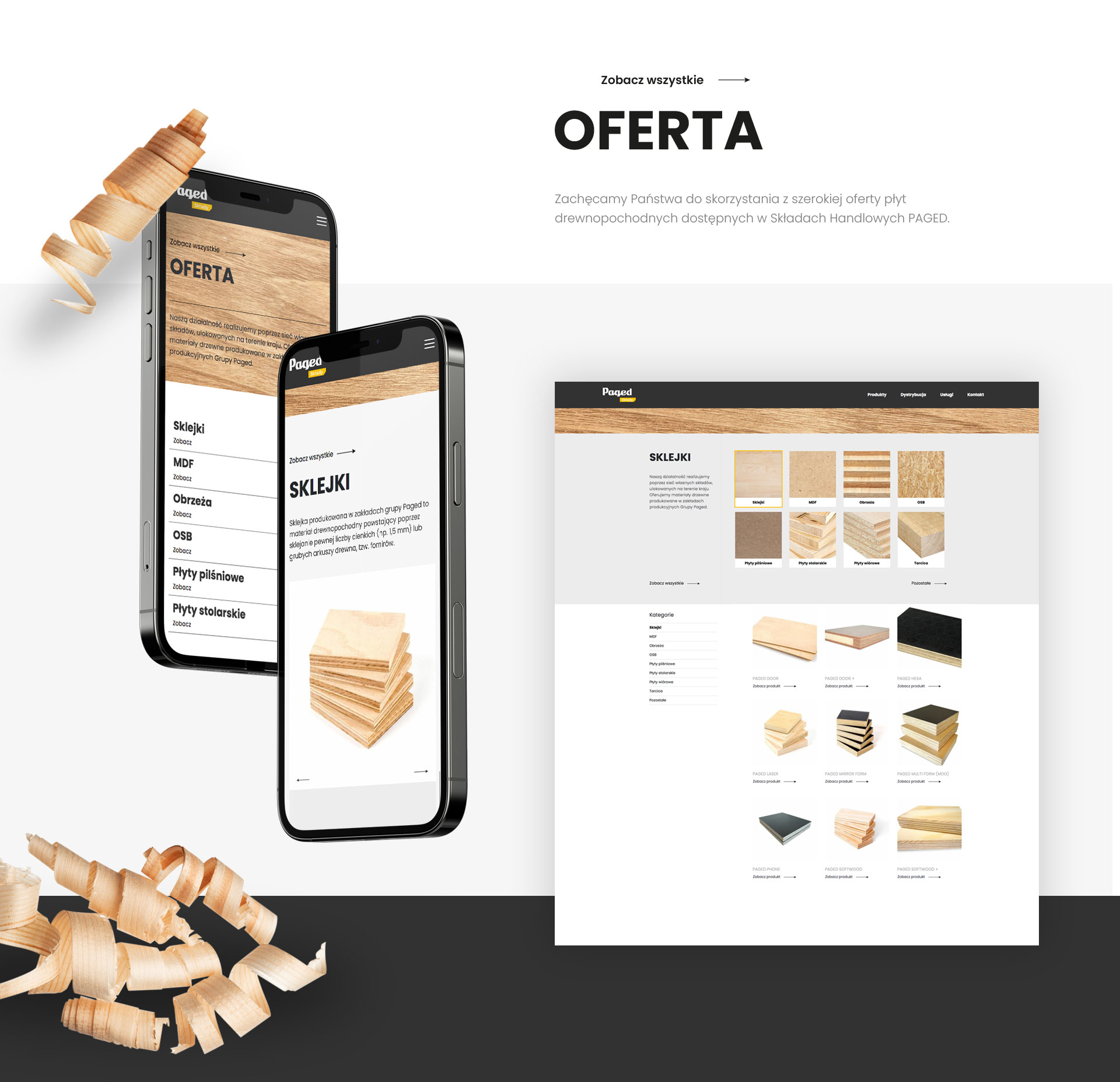
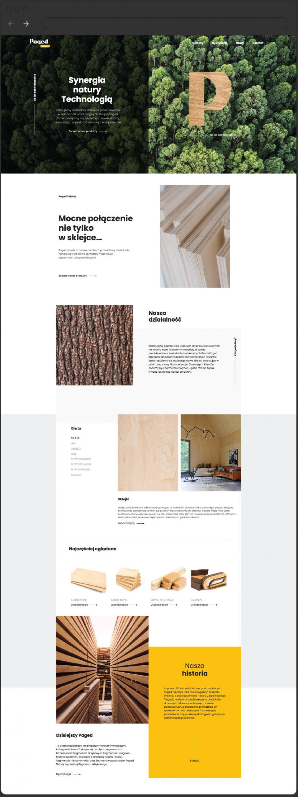
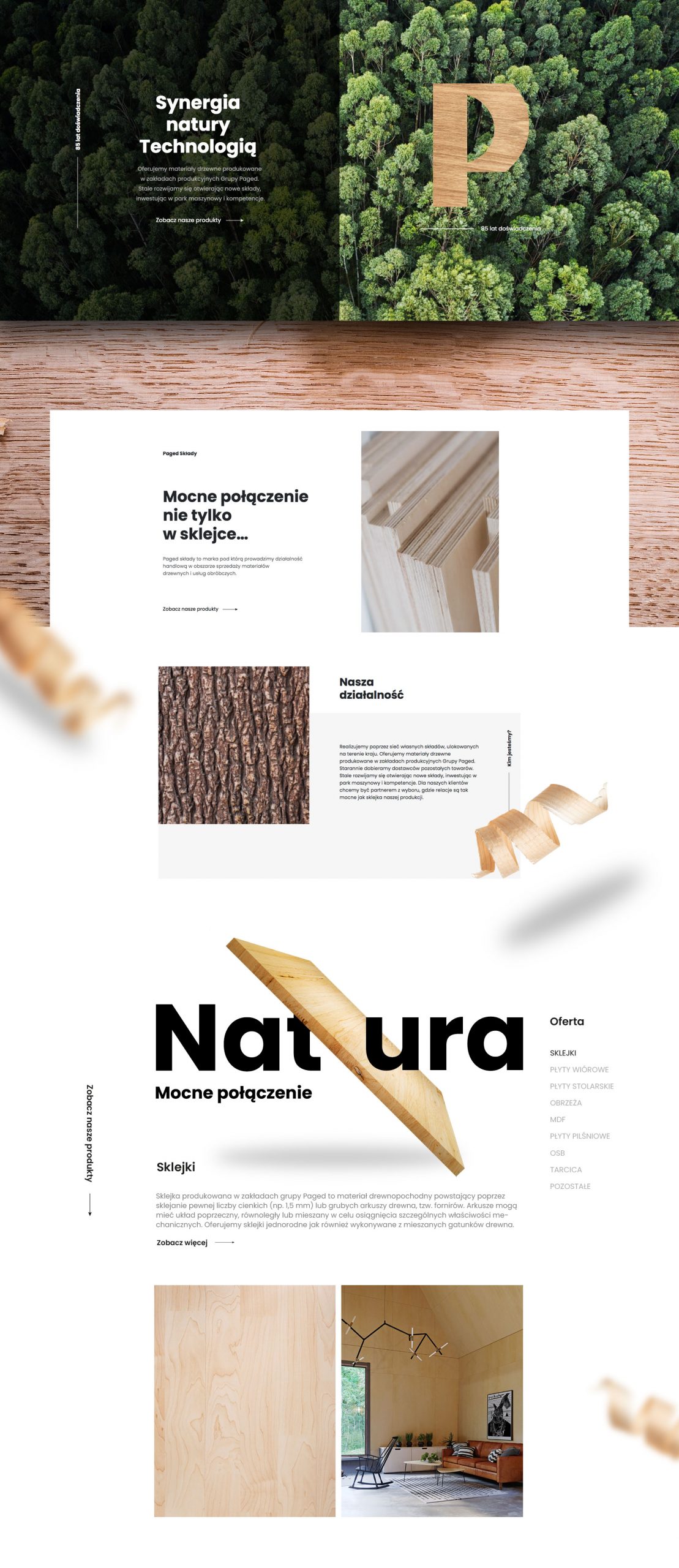
We have created a site that draws the viewer’s attention to the warm nature of wood as a building block for a variety of things. The manufacturer produces components for both construction, finishing work and furniture industries.

catalog

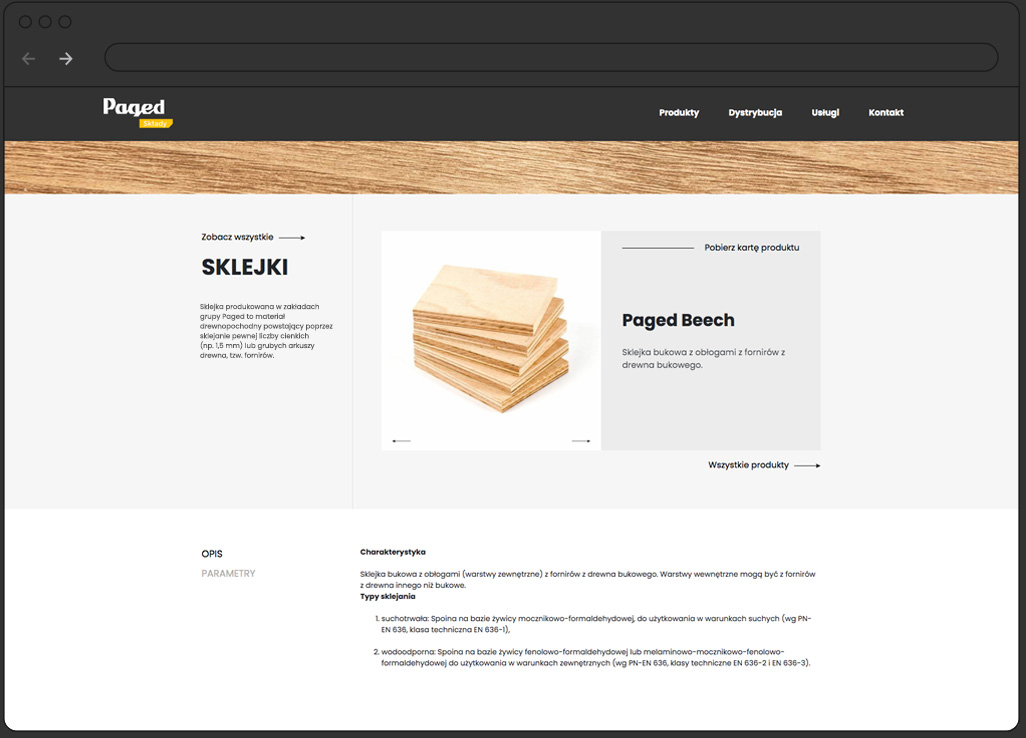
The page has been divided into several separate sections representing each product. Thanks to a clear layout, it is easy to find to fitting solutions.

logo

We have once again finished the job comprehensively. From the logo and its usages to a website that represents the company on the web. We can do the same for you!


other projects:

Ośrodek dojo stara wieś, trzy domki i trawa zielona, niebieskie niebo, wiosna

Cargomove

Cargomove

Cargo Move

Key visual.

  • logo
  • website
  • content

Challenge


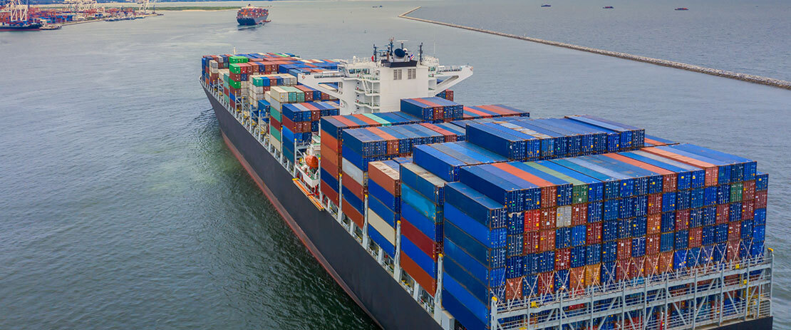
The Cargo Move logistics operator offers a full range of services for shipping goods by sea. Arrangement and operation of freight transport within and outside Europe offers the opportunity for far-reaching trade, taking into account the individual needs of the client and freight challenges. Cargo Move is a marine freight expert.

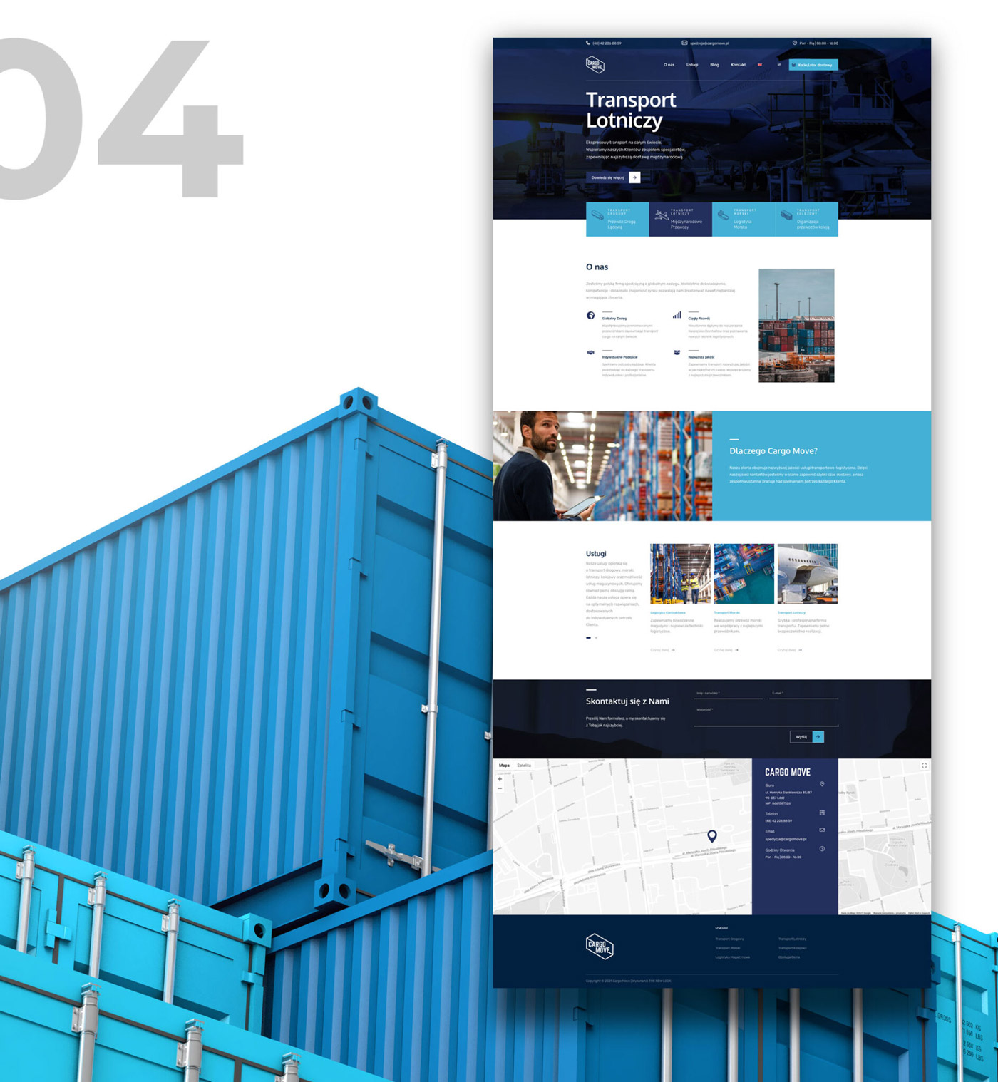
The company needed a recognizable, transport-related identification and a clear information website.

Solution


Comprehensive branding gave the company full control over its graphic identity. The created content has been used in logos, stationery, business cards, on the website and in graphic info.

PRESENTATION

Key visual


We’ve designed a complete brand book and helped register the rights online. Beautiful design goes hand in hand with functionality and simplicity that the transport industry appreciates. If you want to move a lot of merchandise from a long distance, and travel time isn’t your priority – consider Cargo Move as your supplier and freight planner. The popularity of this form of transport is mainly due to the attractive level of cost-effectiveness of the service. In the case of transport by sea, the goods are transported in containers, refrigerated containers or holds in the case of products without packaging or in tankers suitable for carrying liquid substances.

colors


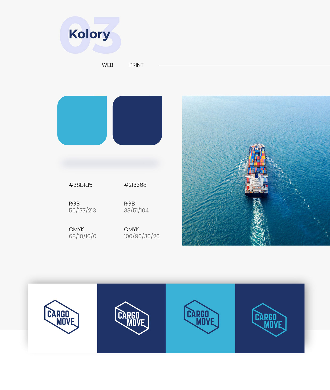
We decided to use a pallet representing the colors of water and air-related elements. The blue tones proved to be a bullseye and perfectly complemented the logo in terms of brand association with a specific field.

pictograms


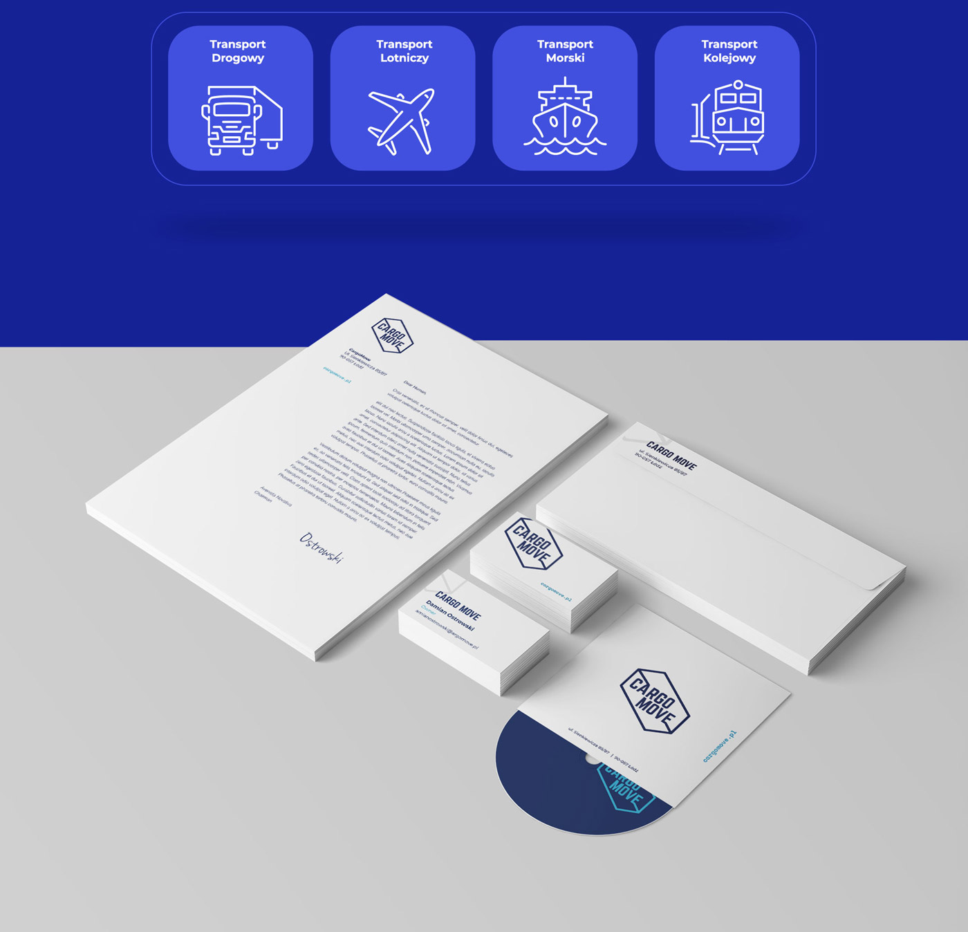
For this customer, we have also designed icons that graphically represent the individual departments in the company that handle different modes of transport.

logo


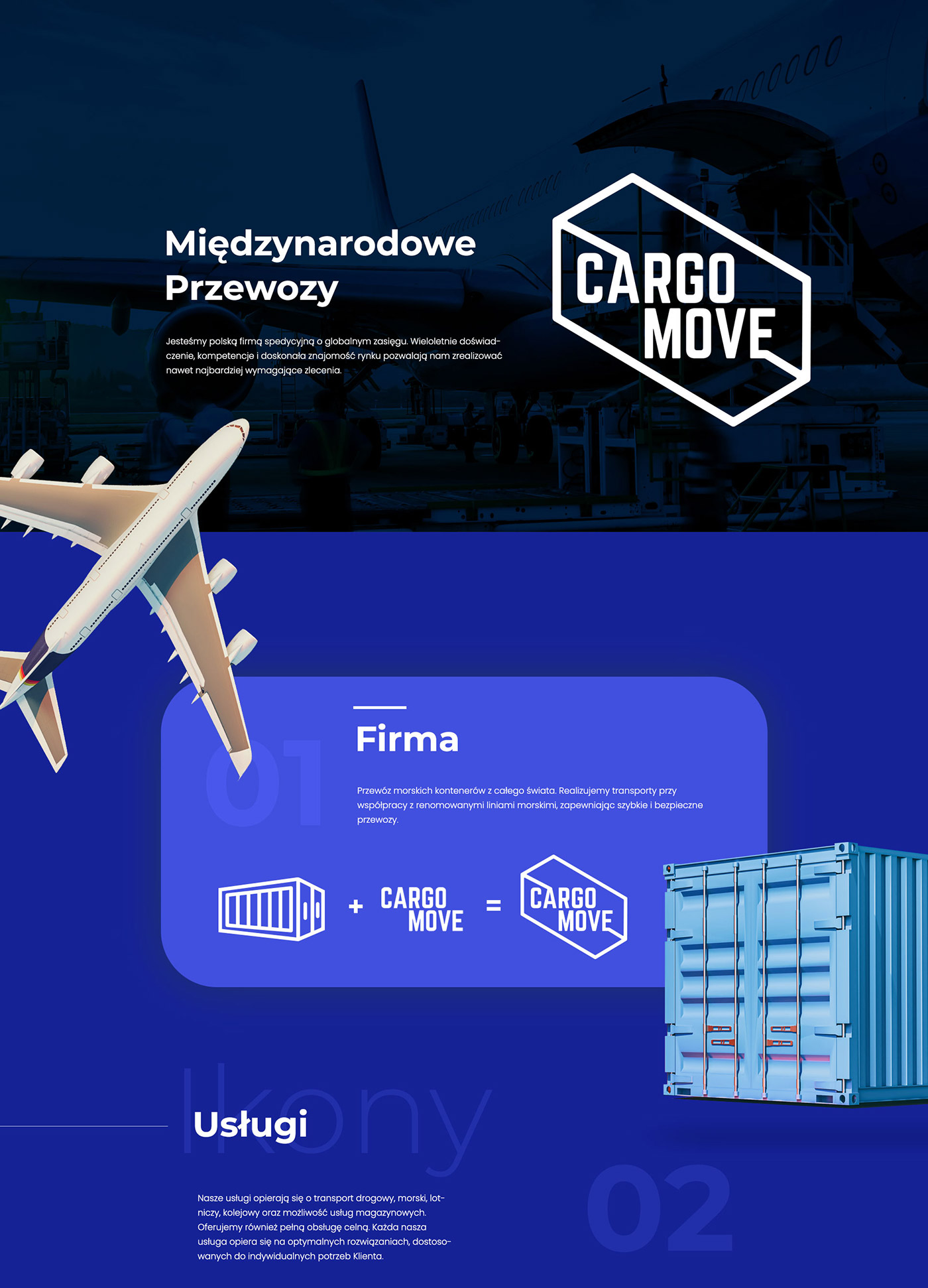
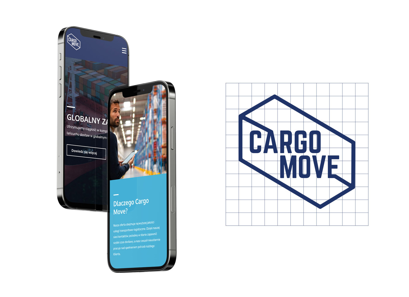
The simple combination of a graphical interpretation of a container and a text consisting of the client’s own name resulted in a  simple, closed graphic symbol composition. The customer and his stakeholders have taken a liking to this logo.

other projects:

Ośrodek dojo stara wieś, trzy domki i trawa zielona, niebieskie niebo, wiosna

Knowit

Knowit

Knowit

Graphic presentation.

  • graphic presentation

Challenge


Knowit is a brand that supports businesses and organizations in digital transformations, simplifies people’s everyday lives and creates secure and innovative solutions that meet sustainability goals.

Solution


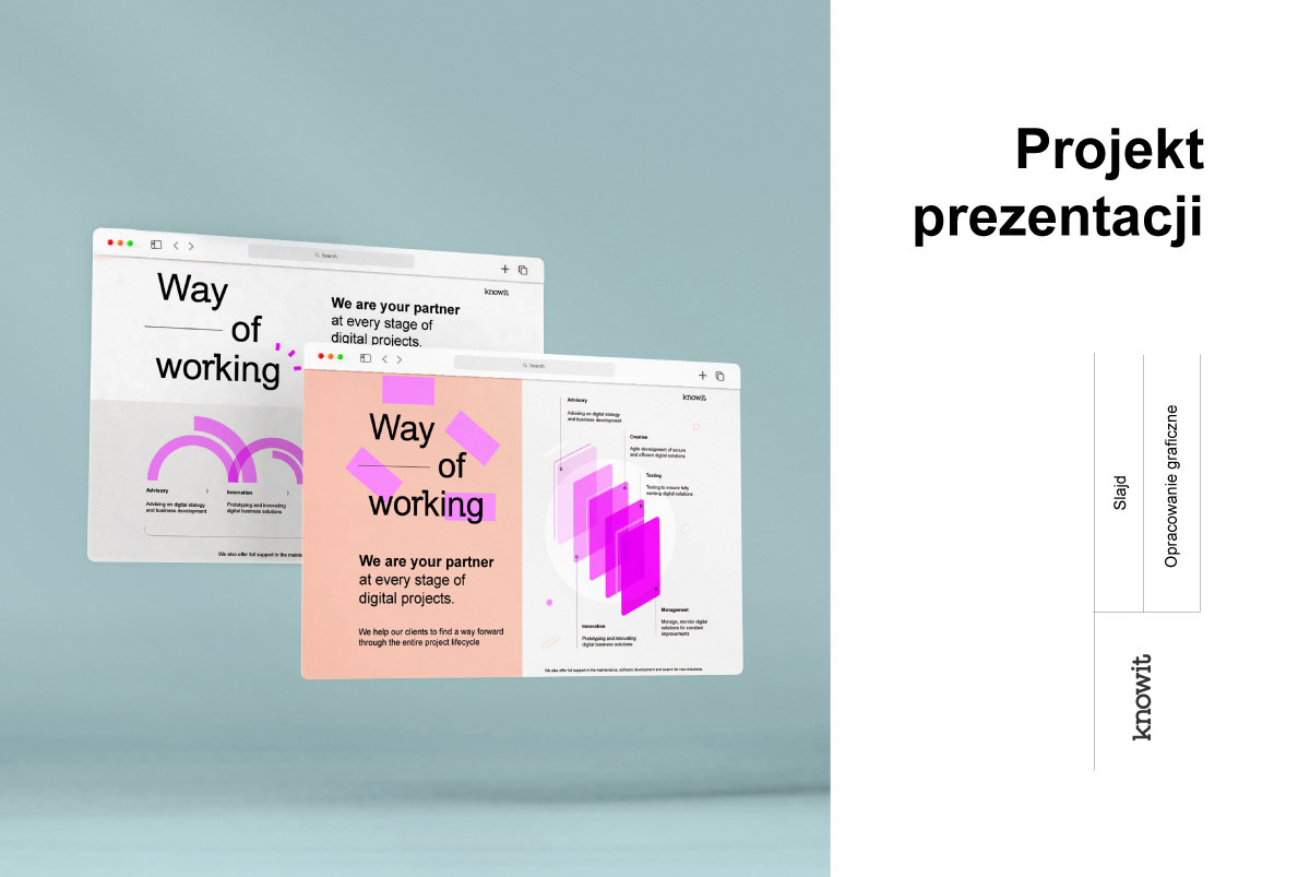
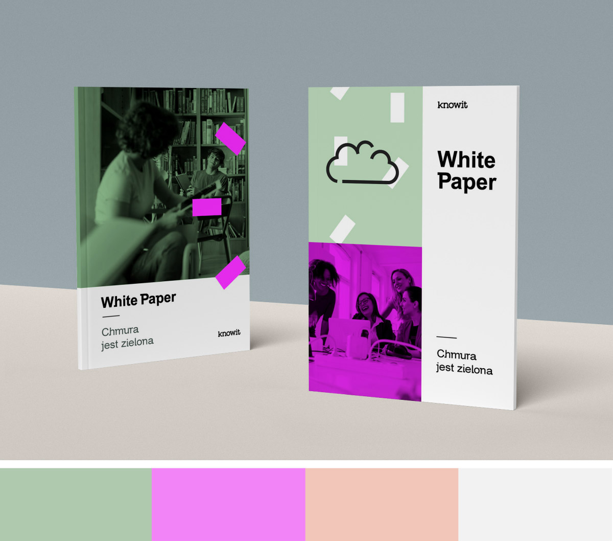
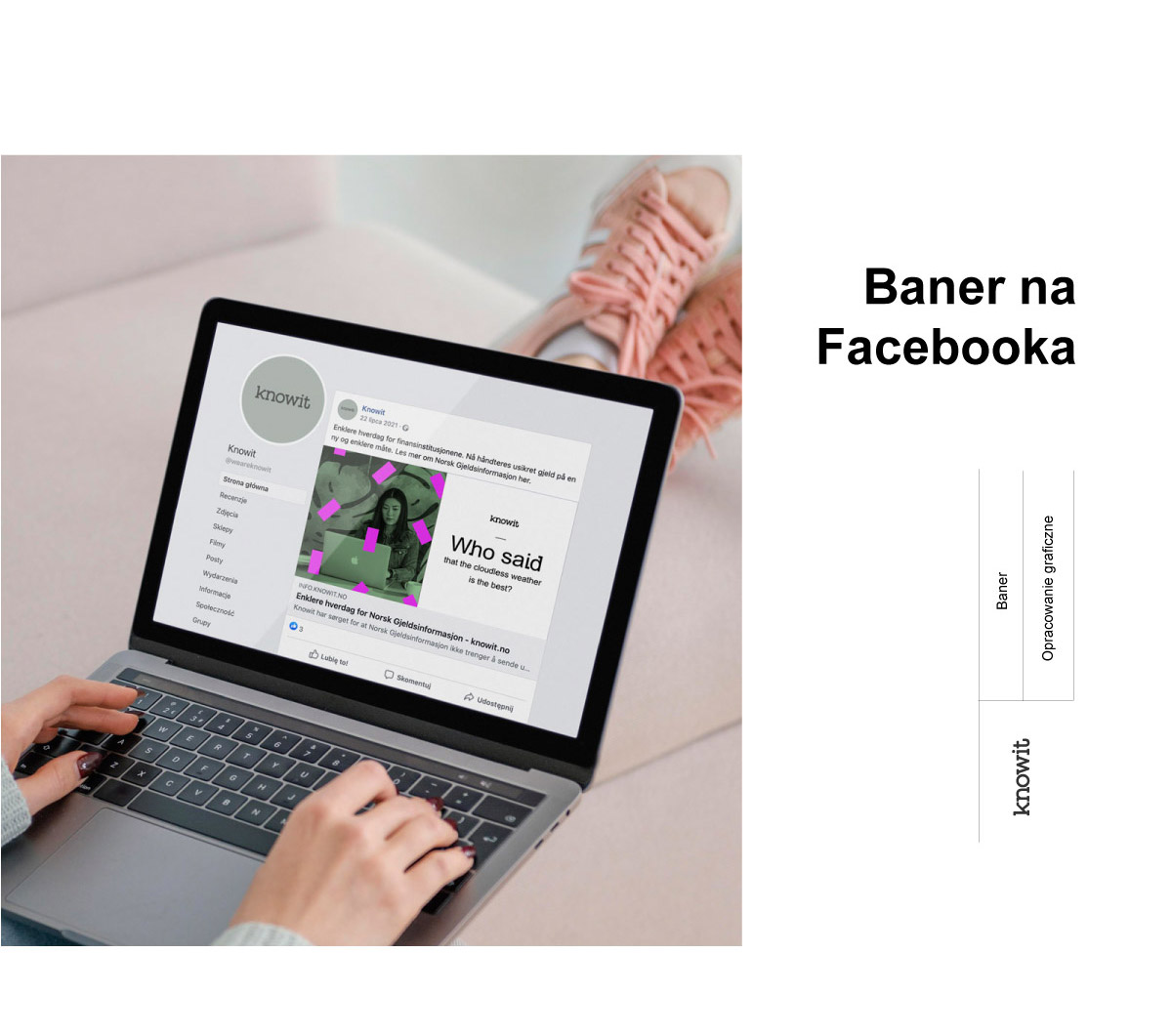
Several images and key phrases are worth more than endless essays. We’ve made a graphical presentation that explains the entire concept.

PREZENTACJA

Graphic presentation


We have based the graphic presentation on a comprehensive interview, so that we could establish the strong and weak sides of the project. Workflow management enables  us to create a product which meets the client’s needs and presents aspects that are important from the business point of view. We’d love to help you as well.


colors


We have chosen stimulating colors. I have selected cheerful colors that bring freshness and modernity to mind. The functionality of this choice is an easy way to communicate key information and emphasize important sentences.

accents


Attention can also be effectively drawn through contrast. Color has a key function, but simple graphic accents, which the recipient can identify with specific areas, are equally important. The correct layout is crucial.

information


In order for it to be easy to remember, the amount of information that we provide to viewers must be skillfully balanced. The page count and the amount of content on each page is crucial. The balance between and graphic content has a key impact on the learning process.

other projects:

Ośrodek dojo stara wieś, trzy domki i trawa zielona, niebieskie niebo, wiosna